During the ‘branding’ session of the Accelerator programme, Kevin realised his current firm name, KWC Tax, didn’t reflect the future of where the business was heading.
His virtual CPA firm focuses only on tax services for high-net worth individuals and businesses, and he wanted to attract tech-savvy clients. He told us, “I don’t want anything traditional, boring or looks like the typical CPA. I want my new brand to be hip, modern and fresh – I’m willing to be bold!’’
Branding Workshop
First, Kevin began with a branding workshop to talk with us about what a non-traditional accounting brand could look like for him.
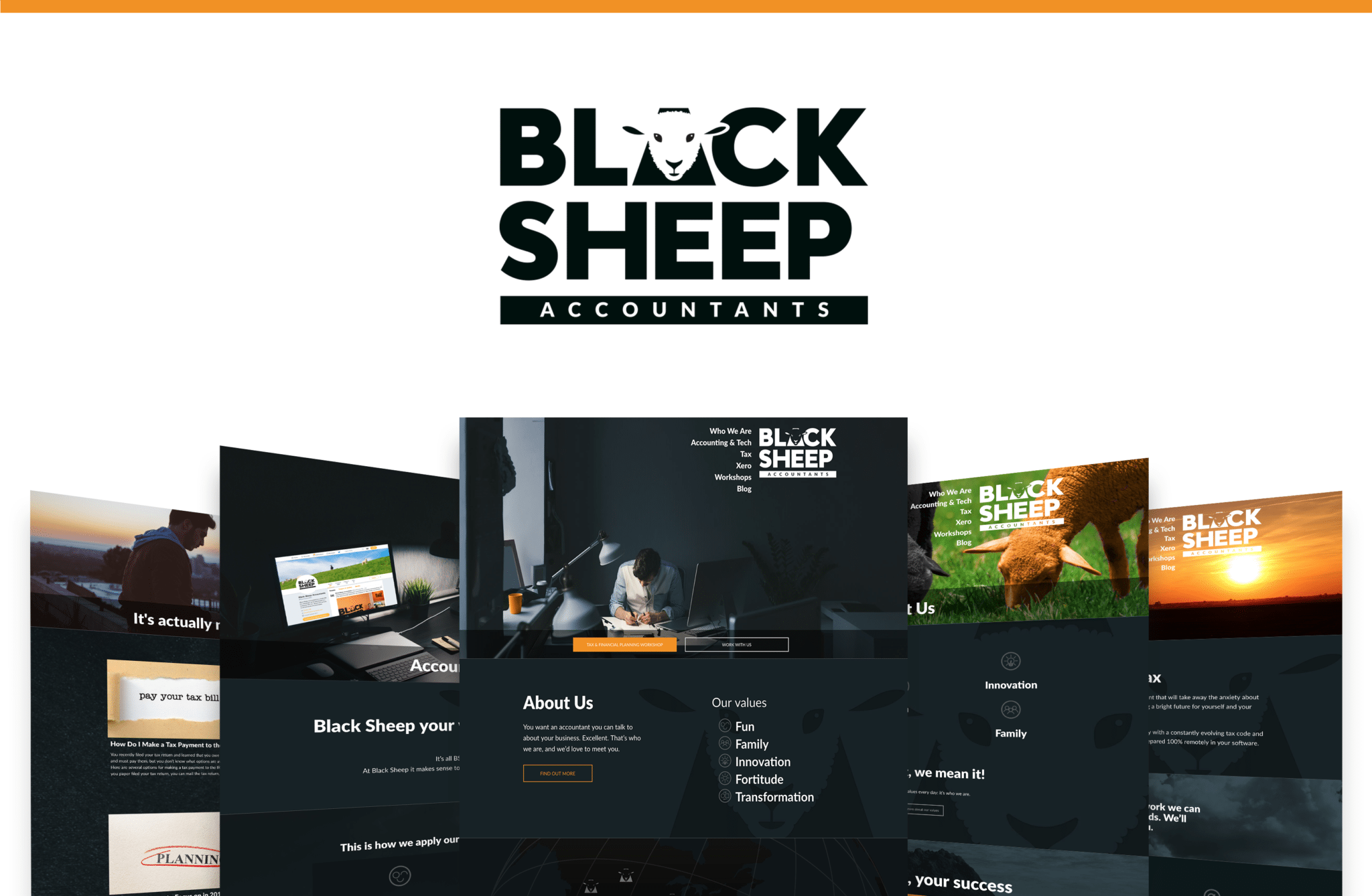
He strongly identified with the words fortitude and dauntless, and we talked with him about what those words actually meant. One of the conversations we had was about the fact that a brand isn’t to be too obvious, but have meaning behind it that continues to be seen over time. A direct ‘Dauntless Accounting’ or ‘Fortitude Accountants’ would be too obvious, and we dug deeper into what those words meant to him. Kevin wanted to do things against the grain – but in a good way – an accountant that his clients loved, even if other accountants thought he was too different. Like the ’black sheep’ of accounting.
Now we were onto something! Together with Kevin, we explored the positive and negative meanings associated with ‘Black Sheep’. We recognised that when done properly, ‘black sheep’ didn’t have to be negative (as in, someone who doesn’t fit and causes trouble – rather, someone who doesn’t fit, and that’s a good thing!). We agreed that with the right imaging and visuals, it would be an amazing brand!
Our Head Brand Designer, Col Gray, went to work sketching several versions of sheep’s heads. There were dozens of versions: some looked very tough and menacing, some looked very gentle and cuddly, and some didn’t even look like sheep at all! We also looked at different sizes and shapes for the sheep’s eyes and ears to give it just the right balance of authority and approachability.
After many iterations, the end result was a bold face and softer ears to convey authority while being approachable and confident.
Website Design & Build
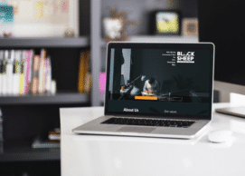
Armed with a bold new brand, Kevin went on to create a new custom website. We agreed that everything was to be Black Sheep – how he works with clients using the latest technology and fixed pricing, his tax & financial planning workshops.
He is also passionate about living his core values: fun, family, fortitude, innovation and transformation. We discussed ways of showing his values throughout the site and suggested sharing family photos. Kevin liked the idea of sharing his values, but wasn’t sure about showing family photos. After thinking it over, he realised that family is a value he stands on every day, and wants to share his values with his visitors. He also recognised that if he intended to be real, and human, this needed to come out on his website and marketing.
Whilst video was a new thing for Kevin, he was willing to make an effort in this area to help connect with his prospects in advance of doing business with them. We had fun coming up with the “let’s talk BS” concept, which of course could mean multiple things!
There were a few times when we had to have long conversations about what went in the website, and what didn’t. We welcomed any and all of Kevin’s suggestions, and we talked together about which ones would be implemented (and which left behind). For example, we considered adding a lot more orange to the home page and other pages – in buttons and icons in particular. We tried it, and the PF website developers shared that rather than making it look good and standing out, now the orange was confusing. It would be hard for the site visitor to know where to click if everything seemed to be orange.
We went back to a simpler approach, with a few orange buttons and icons, and some buttons only outlined (rather than filled) in orange – and both we and Kevin agreed that this simpler, cleaner approach would be the best experience for the visitor.
New brand and website in action
Once the site was built and shared with the world, it wasn’t only Kevin who loved it. “Clients love my new brand,” Kevin told us. “There was never any stigma associated with the name ‘Black Sheep’ – people embraced it right away.”
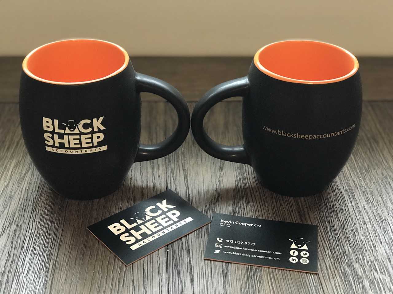
He’s embraced it fully in everything he does as an accountant, incorporating it into every area of his marketing! He had a custom wall with the Black Sheep logo designed for his office and frequently records videos in front of it. He had Black Sheep mugs made as gifts for his clients, with black on the outside and the secondary orange colour on the inside. He hand-delivers them wherever possible, and his clients rave about how much they love them (and often ask for more!).
The whole process has made a massive impact on Kevin and his approach to marketing and branding. He now feels much more confident in himself, his brand and his company, and shared with us:
“Brand is more of a vision. It takes a lot of analyzing who you are, what your business is and what you want it to be. There’s really no point to even creating a logo until you understand what you’re all about. I think investing the time and figuring out who you are and then designing your brand around that vision is incredibly important. If you don’t have that, you’re just aimlessly wandering into the future.
Until I had this brand and logo, I didn’t have who I am and where I’m going solidified in my head.
Now that I have my brand, logo and new website, I feel like I’m ready to start writing blog posts and recording more videos. My website is like a garden. Once I’m done planting, it’s just the beginning, because all the plants are growing.”