After graduating from the PF accelerator, Mark Tickel was ready to launch his own brand. He had worked as a partner/director in another firm, and was ready to create his “army of one”.
With everything he learned in the 12-week course, he knew the direction he wanted to go. He wanted a brand capturing the idea of businesses starting anew, with the vibrant feel of coastal town Brighton, where he is based.
Mark wanted his brand to focus on his love of teaching, something he considered before he qualified as an accountant:
“I had wanted to be a teacher. I believe there will be a demand for the helpful, teaching, guiding, down to earth assistance that I want to provide for small businesses.”
This would be a completely new brand, with a website to support it. We agreed a Rocketspark website would be best – with Mark as the sole owner, the Rocketspark platform would give him the ability to edit his site going forward, whenever he wanted. But first stop: brand!
First, choose a name for the new accounting firm
The first stage was a Brand Explorer to identify words and phrases that represented who Mark is, and the kind of clients he wants to work with. Those words would help lead us to potential names for the firm…but brainstorming first.
One theme that kept reappearing was that of freedom, family time and fresh air for clients. Mark shared his story of coming from London to Brighton, and how he loved being by the sea and getting out in the fresh air with his family and the family dog:
When you’re at home, life revolves around getting stuff done, staring at computers, ipads, iphones. When you’re out, that doesn’t matter. I feel very fortunate to have done well, and my kids have a good life – that’s what I want for them, for clients. A better life, better business, and making money and tax should be a by-product of that.
This was a powerful theme, the core of Mark’s new brand. We went deeper into this concept of fresh air, and helping support clients so they can live their lives. All our conversations came back to this idea of fresh air: Bringing your head above water, going for a walk to think about things, not holding your breath waiting for the problems to go away.
From there, a shortlist of names came: Fresh air, Freedom, Breathe, Open Sky. All had connotations of providing freedom, open and honest support… but none of these were hitting the mark 100%.
We revisited the conversations Mark would be having to think about the messaging. Everything came back to businesses coming to Mark and starting over, turning over a new leaf, starting on a journey, a new path with the right accountant. It was about starting “afresh.”
The word “afresh” kept coming up, and everyone agreed this was a fantastic new name to use. It captured all the ideas Mark wanted….so now it was time to visualise the name with a logo and brand colours.
Next, create a logo symbolising fresh air, movement and direction
We looked at the notes from all the conversations thus far, reviewing common themes including looking forward to the future, having space, being able to breathe, openness.
The initial concepts captured this through the use of lines, symbolising forward momentum. But the earlier concepts gave an agricultural feel, which wasn’t the idea Mark wanted.
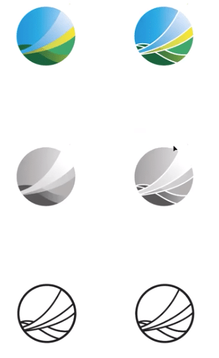
So the name “Afresh” and synonyms were revisited: Starting anew, reviving. This helped move to a more symbolic concept with one clear symbol.
The brand would symbolise turning into a brighter era, turning over a new page or chapter when working with Afresh, as well as bringing in the brightness of sunshine and the Brighton locale.
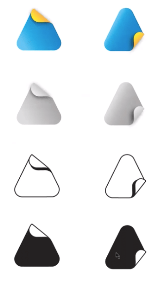 The final version of the logo took the momentum from previous concepts and the idea of moving forward with lines to represent starting anew, and curves brought in the breeze/waves of the Brighton area.
Once that was nailed, typefaces helped deliver the feel of the brand. Did we want a solid and bold approach or a more handwritten, natural, script look?
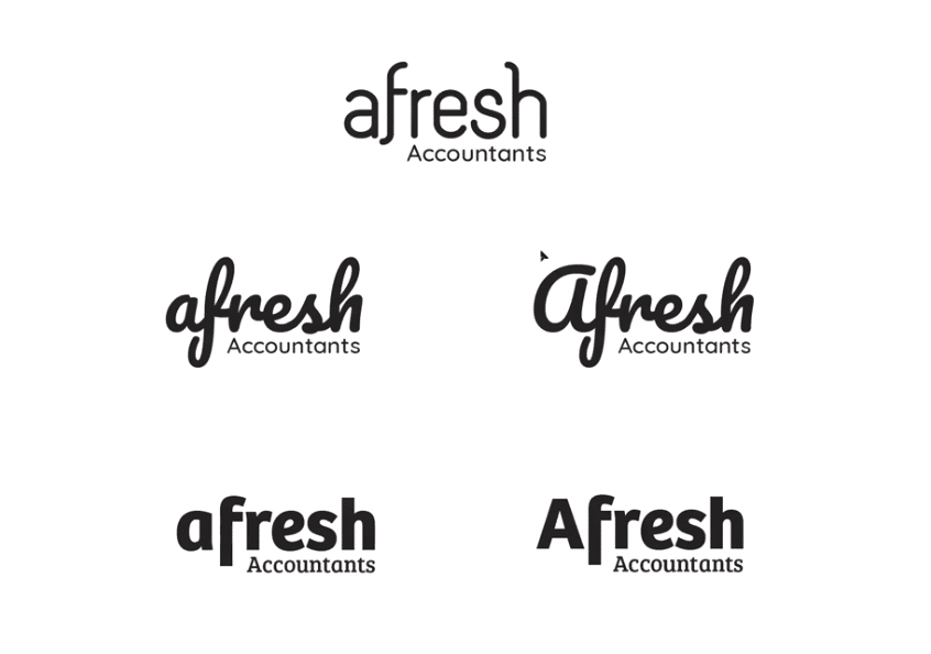
Together we agreed on a more scripty font as it worked well with the curves of the logo, and both the font and icon flowed well together. It was Mark’s own shape, unique to him, with different ways to symbolically interpret the icon.
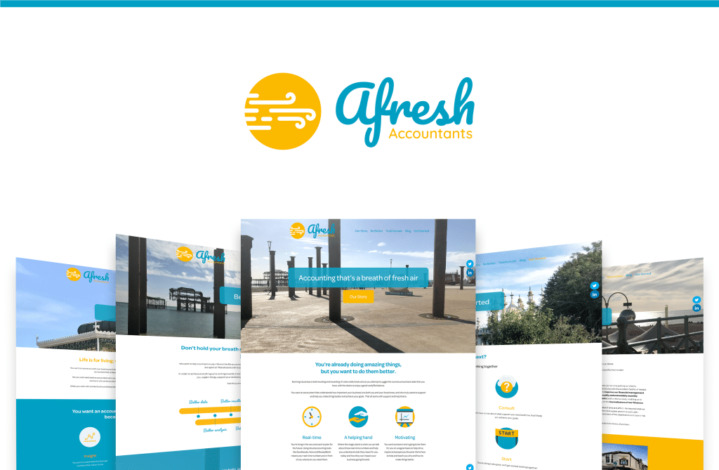
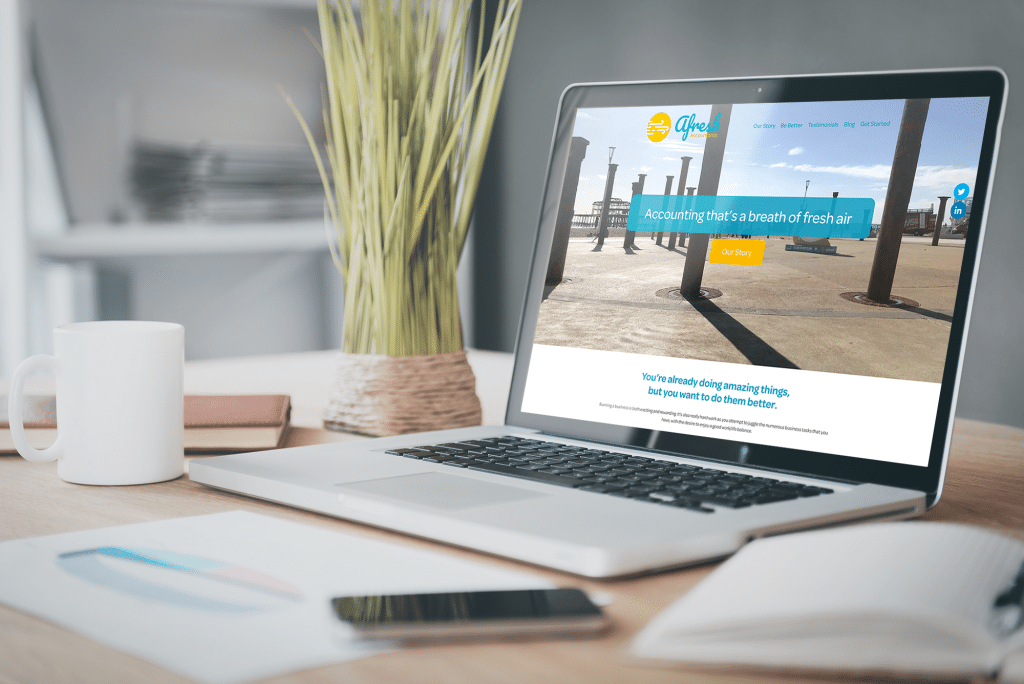
Website build: Showing Mark’s process and choosing pronouns
With the brand finalised, it was time to plan the website, starting with the home page. The home page is like a “little mini website”, displaying the core messages from all the other pages.
One of the discussions was around the use of pronouns. One option was to use “I” throughout the site, showing Mark as the sole person behind Afresh. The other was to use “we”, giving longevity to the brand. It would also represent Mark’s goal of recruiting and building a team.
We settled on using “we” throughout the site, with individual sections about Mark personally to show his backstory and his journey to setting up Afresh.
The remaining pages were reviewed, with a different spin on the services and contact page. Mark had shared the process he wanted people to take when working with him, focusing on “being better at everything.” This concept would eventually become his “Be better” page: instead of the typical boring ‘accounting services’ page, it would focus on the journey his clients would take.
He also opted for “Get started” instead of “Contact”, using the page to qualify leads with a diagnostic before getting in touch.
The end result is a vibrant look launching Mark’s new firm to the world, capturing the feeling of starting anew with the bright locale of Brighton.
We’re thrilled to see Mark has taken what he learned from Accelerator, creating his own content based on questions his clients are asking him – great job Mark!