For Raedan, it had only been a few years since they reviewed their brand. They had a very clear understanding of who they were as a firm, but they weren’t completely confident that the brand reflected that.
They knew they definitely didn’t want a traditional conservative blue brand. They knew they wanted the brand to exude modernity and simplicity. And they had questions about whether Raedan was the best firm name to reflect the way they did business.
With the help of our Head Brand Designer Col Gray, we kicked off the project with a branding workshop. During the course of these sessions Jonathan decided to convert the workshop sessions into a fuller branding identity project. Here’s what happened along the way:
- Definition of what “Raedan” means: Jonathan shared with us that “Raedan” is actually a variation of “Rædan”, meaning “to advise, to interpret”. It was an old Anglo Saxon word, with the ‘ae’ combined, and the meaning was perfect for this accounting firm. However, the two joined-up letters caused issues in brand simplicity, so we agreed to use the ‘ae’ as separate letters and modernise the spelling.
- Agreement on the pronunciation: Jonathan had multiple stories to tell about him and his team answering the question “How do you pronounce it?” (We even had some confusion on that by the PF team too!) Was it Ray-dan, Ree-dan, Ray-e-dan or something else? A major agreement that we came to with Jonathan was to ensure that the client’s perception and pronunciation was key. It was critical that Raedan have a relationship with their clients that was supportive and responsive – and constantly correcting clients on name pronunciation wasn’t a help for the brand. We all agreed that the “Ray-dan” pronunciation made most sense.
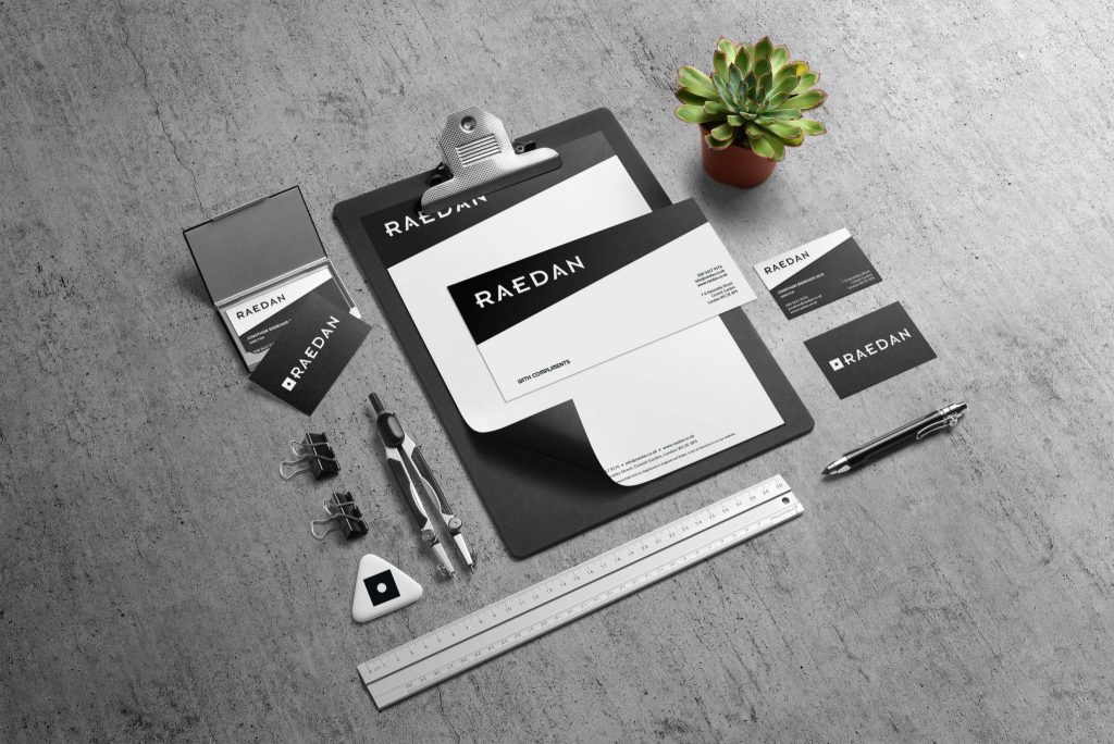
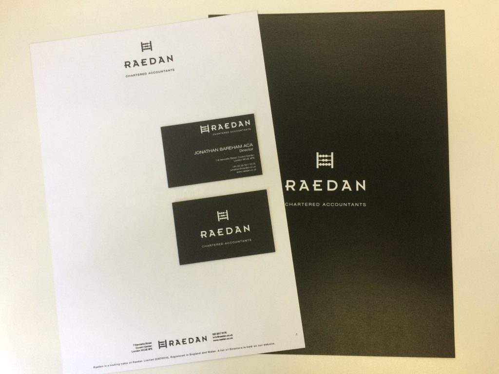
- Refreshed the logo: The old brand included an abacus, as well as the words “Chartered Accountants”. The overall image was clean and simple, but we felt the abacus gave an old fashioned and traditional image, which Raedan clearly weren’t. We made some slight adjustments to the logo, that kept the simplicity, embraced the Anglo-Saxon element (notice the helmet-like ‘A’ in the font used on the website), and gave Raedan confidence in the brand to reflect who they were.
The resulting brand refresh has provided Raedan with a reflection of the journey they’re on. The branding journey helped provide them with some powerful messaging over the meaning of the word and what they stand for, which they’ve captured brilliantly on their website!
And if you want to hear from Jonathan, about the whole process, you can check out his blog post on their new look!