When Paul McCann started his marketing journey, he just wanted to learn more about how it worked and how it could work for his firm. He joined Accelerator, and as he worked through it, knew it was only the beginning. Having left his old job out of desperation, he’d trekked off on his own and was ready to make some major changes. “I do zero marketing” he told us, “but I know that if I’m going to run a business I want to be a part of, I need to do more.”
Paul knew his brand was in need of an update. For him, it didn’t encapsulate the type of people he wanted to work with. Paul had big plans to grow, and felt his current name and logo weren’t a fit for those plans:
“I knew I needed to get out of my current situation and fast. I scoured the state’s copyright website to make sure there were no other “McCann Advisors” out there. There weren’t, so I took the name and started my own firm. As time passed, people kept telling me ‘You’ve got quite a reputation around here.’ Which was great, but I knew it was mostly because my dad had made the McCann name a small town hero. I’m interested in growing beyond a small town accountant.”
Armed with his learnings from the accelerator program, Paul quickly decided it was type for a much-needed brand re-do, which all started with the Brand Explorer:
Creating a brand story, and name which solidified Paul’s background
During the Brand Explorer sessions, Paul told us that he wanted his brand to represent a modern, clean and simple identity, one that shows his support of micro-entrepreneurs and his passions for microfinance.
A lot of words and phrases were brainstormed: Independent, freedom, adventure, daring, emprise. They were a great platform to start, and quickly became values Paul and his clients had, but they weren’t a fit for an eventual name-change.
What we found to be missing was the personal brand story, which became a talking point during the explorer. Paul shared his love of Kuju Coffee, and their links to donations towards the National Parks service. He wanted something similar with his own brand, telling us about his own story of him and his wife working in Peru with a Christian development organisation.
“Pucallpa is a lumber town on the Ucayali River in the central jungle region of Peru. Pucallpa (pronounced pu-kal-pa) is a Quechua (pronounced catch-u-a) word derived from the native Peruvians meaning red dirt or red earth. The soil is largely red clay, very slippery when wet and ubiquitous during the rainy season. The bottom portion of the logo represents the cracked red clay after baking in the sun.”
This was a fantastic personal story and one that was important to Paul. It captured his passion for helping microbusinesses, and was something unique to him as a brand story.
We looked at the translation of “Pucallpa” and came to the conclusion that “Red Earth” was a fantastic name, which Paul agreed with. It encapsulated his history in Peru, particularly his time riding a Yamaha XT 350 through the red clay and dust.
With the name solidified, next came the brand and logo:
Bringing the sun, the river and the story into the Red Earth logo
There were a lot of factors that went into the story of Red Earth and Paul’s time in Peru: The Ucayali River, the Sun, Paul’s motorcycle, the name itself. It was clear that any logo needed to encapsulate every element that made up the brand story.
With this in mind, Col went to work, presenting a multi-layered concept to capture everything Paul wanted in his brand.
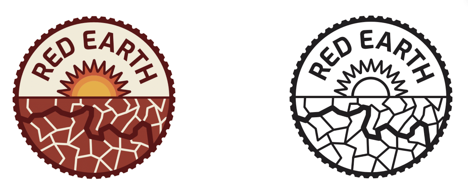
This was a very detailed brand concept, with several layers of meaning. The thick line running from right to left represents the Ucayali River passing through Pucallpa. The sun represents not only the Pucallpa flag, but also the rear sprocket of a motorcycle. The tread on the outside of the logo represents the off-road tyres of Paul’s bikes.
And then there’s the name along the top, one which Paul is extremely proud of. He fell in love with the logo concept and name, using is as “a tribute to the Peruvian people. They’ve inspired me with their spirited attitude and determined work.”
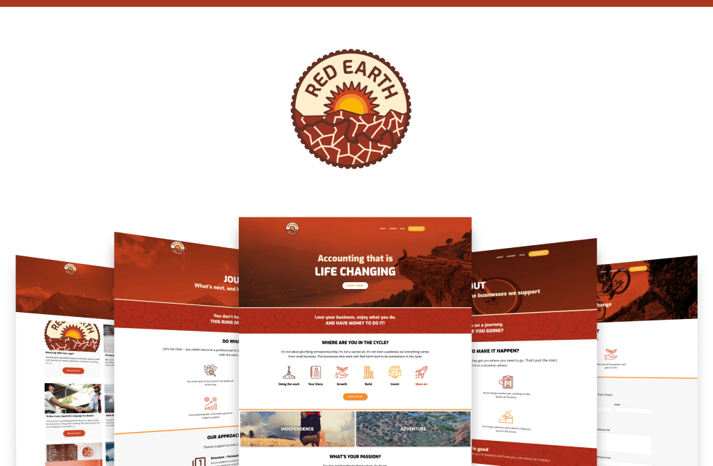
Building a website that showcased adventure, passion and standing out from the crowd
Paul’s passion for helping people shows up strongly in the way he shares his journey. It was clear from a website perspective that we needed to make that passion come through.
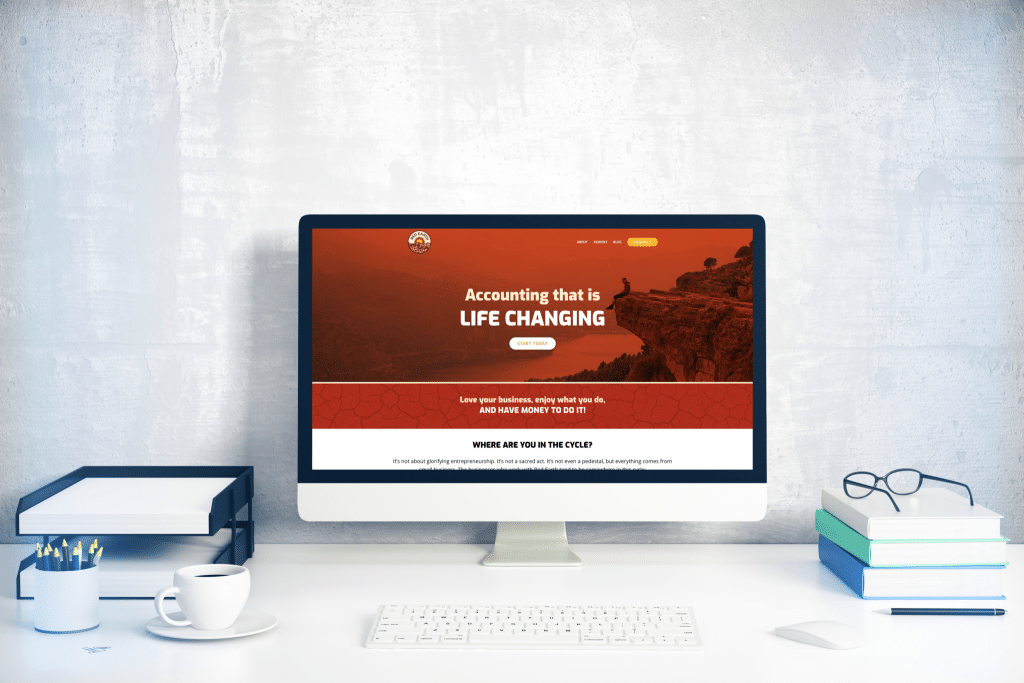
With the brand finalised, the next step was building the website. Starting with the homepage, Paul and the team had a shared vision that his site wouldn’t look like a stereotypical accountancy site. We wanted people to come to the homepage and almost wonder if it was an accountancy firm, especially with the name “Red Earth.”
As we were strategising the homepage, a lot of the messaging came directly from conversations we’d had with Paul, which we decided to highlight as red banners to appeal directly to his target audience. Phrases like “love your business” and “you would go stark raving mad if you retired” all linked to the idea of Paul’s services being “life changing”.
We also chose to highlight Paul’s values of independence, adventure, gratitude and community. These were values personal to him, but what we found in our conversations was that his ideal client also lived by these values, and by putting them on the homepage and about page, it would help qualify his visitors so that the right kind of people would be getting in touch.
As we strategised the remaining pages, we also discussed other website elements, particularly:
- Journey, not services: Paul wanted to move away from the stereotypical “we offer xyz services” people come to expect on accountancy sites. He told “I don’t think people really care exactly what I provide, it’s about the journey.” and how his clients go on a journey towards their ultimate goal. Because of this, we chose to create a “Journey” page showing the support Paul offers at various stages of a client’s adventure.
- Connect, not contact: It was important to Paul to qualify people visiting the website, making sure people who truly aligned with his values were the ones getting in touch with his site. It was also important to highlight the idea of partnership with Paul, which is why we opted for a “Connect” page with a diagnostic, as opposed to a “Contact” page. With this, we made sure the diagnostic included fields relating to his niche, as well as linking them to his values by asking the user about their own next adventure.
- Pricing: Paul is very passionate about pricing, and the belief of it being core to trust and honest in the relationships with his clients. Originally, we planned for a section on the Journey page with his 3 packages, but instead we opted for a video from Paul about his approach to pricing. This was so he could move away from the 3-tier options, and tell his own story on how he prices and why.
Choosing the right imagery, and finding the balance between stock and unique images
The final piece of the puzzle was website imagery. Paul shared a mammoth collection of images from his time in Peru, showcasing working with business owners, playing with children, riding the motorcycle, the Peruvian landscape and more.
Initially, we opted to use solely imagery from Paul’s time in Peru, but what we found is that it gave the wrong feel, instead evoking a charity-style look and not a sense of adventure and passion.
This meant a new approach was needed, and we agreed to use a balance of stock imagery, with the occasional real-life photo from Peru for background imagery, like the calls-to-action. By doing this, we are able to find dramatic images that symbolised risk, adventure, taking a journey and momentum, themes which were core to Paul’s new brand.
In the end, Paul’s new brand and website have given him clarity on the message he is trying to community, as well as a platform to express a personal brand through his values. We’re also extremely proud to have convinced Paul to record his first video for the site, and Paul also commented:
“At first, I was uneasy about branding and logos; I had inconsistent messaging and a clunky website. The PF team guided me along the path of creating what I want to create without steering me into their preferred channels. They listened to what I wanted and helped me create it. They read through the lines of what I was saying to interpret what I really wanted to say.”
Next comes the blog content, and we’re thrilled to see Paul on our Navigator program to get regular feedback and direction with his marketing efforts.
And if you want to find out more about Paul’s journey, you can read his very own blog posts on his brand journey here and here.