Spark is such a bright, cheerful name for an accountancy firm! Supported by the slogan “accounting with passion”, it perfectly captures who they are: Fresh, excited to stand out, helping ignite enthusiasm and passion as they work with their clients.
But the firm didn’t have a website which matched this.
Phil Burnell came to us when the rebranding process was already in progress. His mission was to get rid of the stuffy image of accountants (changing the name from the traditional “Burnell and Co”), and help clients to realise that choosing an accountant didn’t have to be a stuffy, boring decision.
Phil asked for our feedback on the options he had been given for his new brand. Would he play it safe with a simple, typical-accountancy blue colour? Would he go for a more modern feel with angular shapes? Or really different, really out-of-the-box, with multiple colours and shapes?


Phil was excited to hear that we agreed entirely with his decision to choose the most different, most colourful brand option available to him.
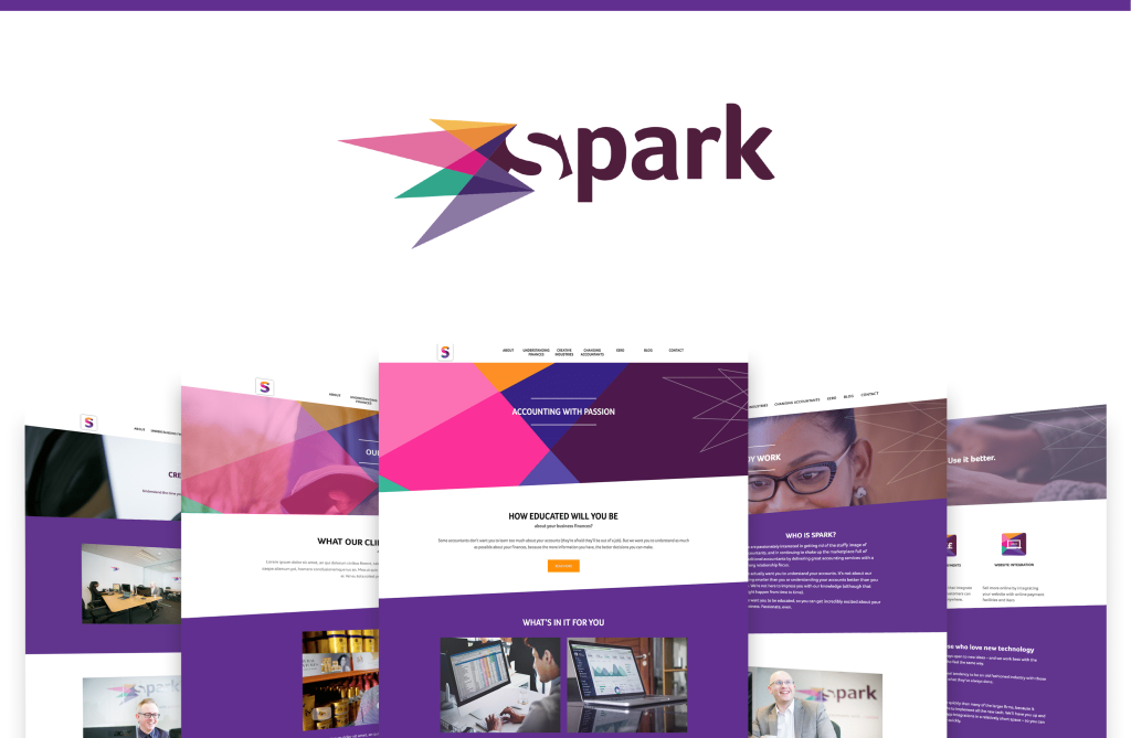
Next up was building a website that matched this new look and feel. Here are some of the elements of that website process:
- Niche content: With his new funky brand, Phil was keen to show his passion for creative businesses, so we created a dedicated landing page to focus on this niche area. Phil wanted the emphasis to be less on accounting and more on the advice Spark would give, solidifying the absence of the stuffy accountancy image.
- Customer journey: Phil explained the journey his clients take when coming to Spark, and how they start with the basics, and over time learn more to move forward with their business. This was powerful messaging we decided to showcase with a landing page, which helped emphasise how Spark were different to other firms out there.
- Content with personality: Spark were enthusiastic about putting some personality into the content on their site, through headlines of “Be fun! Enjoy work” and rhetorical questions like “Could learning about your finances actually be fun? (Answer: Yes.)”
- Integrating the brand in everything: We wanted to make sure that Spark wasn’t simply a logo, but was a brand truly integrated in every small element of the site. We custom-designed everything from number icons for the Spark process to social media icons, and icons for popular Xero features – all unique to Spark!
The result? A fresh, bright site completely devoid of the typical accountancy image, with a strong focus on personality and experience, and including unique brand elements throughout. We love the colours!
Spark didn’t stop there! They continue to take advantage of our daily social media posting bolt-on, and you can find out about the results here.


